Updated Homepage Layout
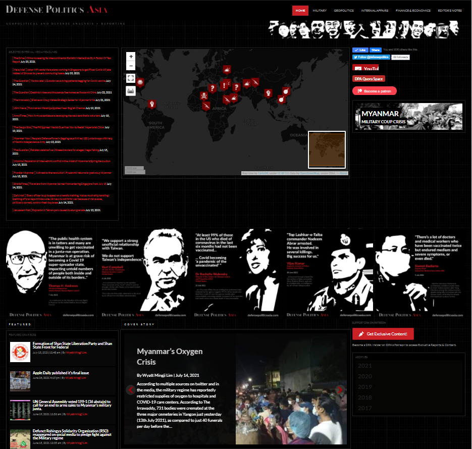
Around 2-3 weeks ago, we decided to put some of our pretty instagram “quotes” images as part of a good “gateway” to read some of what we think are important news/articles.

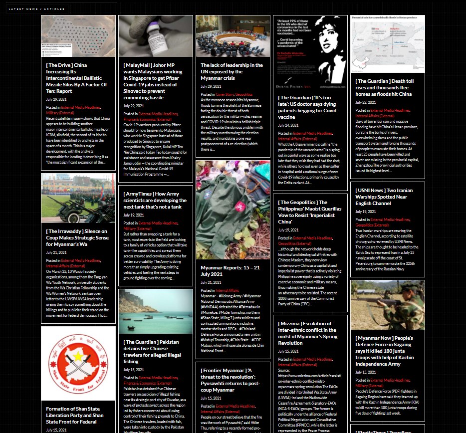
Today, we decided to swap out our rather messy layout of the news via the categories, into a combined “pinterest” style masonry layout – where it would easier for readers/users to check out what are the latest articles we post onto the website.

I had been thinking about the design/layout issue with the home page, as it does not load well for mobile as well. Recently, I came upon a website that deploys a purely masonry layout for all their articles, and I personally found it pretty comfortable to read and navigate through huge amount of content.
Thus I decided to implement that for DPA.
Hope this will make your stay on the DPA website more comfortable! =}

